


From mood boosters to the perfect room effect – color expert Uwe Walter üabout the power of colors in interior design.
Colors are far more than just decoration – they influence our mood, our well-being and even our perception of spaces. Which color trends will dominate in 2025? Which combinations suit the Mediterranean lifestyle on Mallorca? And how can color, light and materials be harmoniously coordinated?
Master painter and color expert Uwe Walter knows the psychological effect of colors inside out. In our interview, he talks about the current color trends, the role of yellow as the color of the year 2025, the importance of olive green and earthy nuances and explains why the Mallorcan living style moves between modernity and tradition. He also gives valuable tips on choosing the right colors for different rooms, the right wall design and the best exterior paint for houses on Mallorca - where sun, salt and humidity pose a particular challenge. Read how color can not only beautify our homes, but also improve our quality of life.
Colors as mood boosters: Which shades will make us happy in 2025? Colors have been proven to have a psychological effect on us. What color trends can we expect to see in interior design in 2025? Is there a specific color palette that increases our well-being?
Events in world history often influence color trends and design trends. People react to their environment with colors, which establishes certain trends. Being happy with colors is strongly dependent on the type of person, but there are colors that shape the spirit of the times. The combination of yellow and olive: This color combination is a striking designelement for 2025. While yellow stands for joie de vivre and sunlight, olive conveys stability and calm. Together, they create a warm, luxurious and timeless atmosphere without being overpowering. Other important colors 2025: Mediterranean tradition meets modern elegance. Mallorca residents often want a mixture of traditional finca charm and modern home design. Which color combinations go perfectly with this style? And what should you pay attention to so that the result doesn't look too colorful or cold?
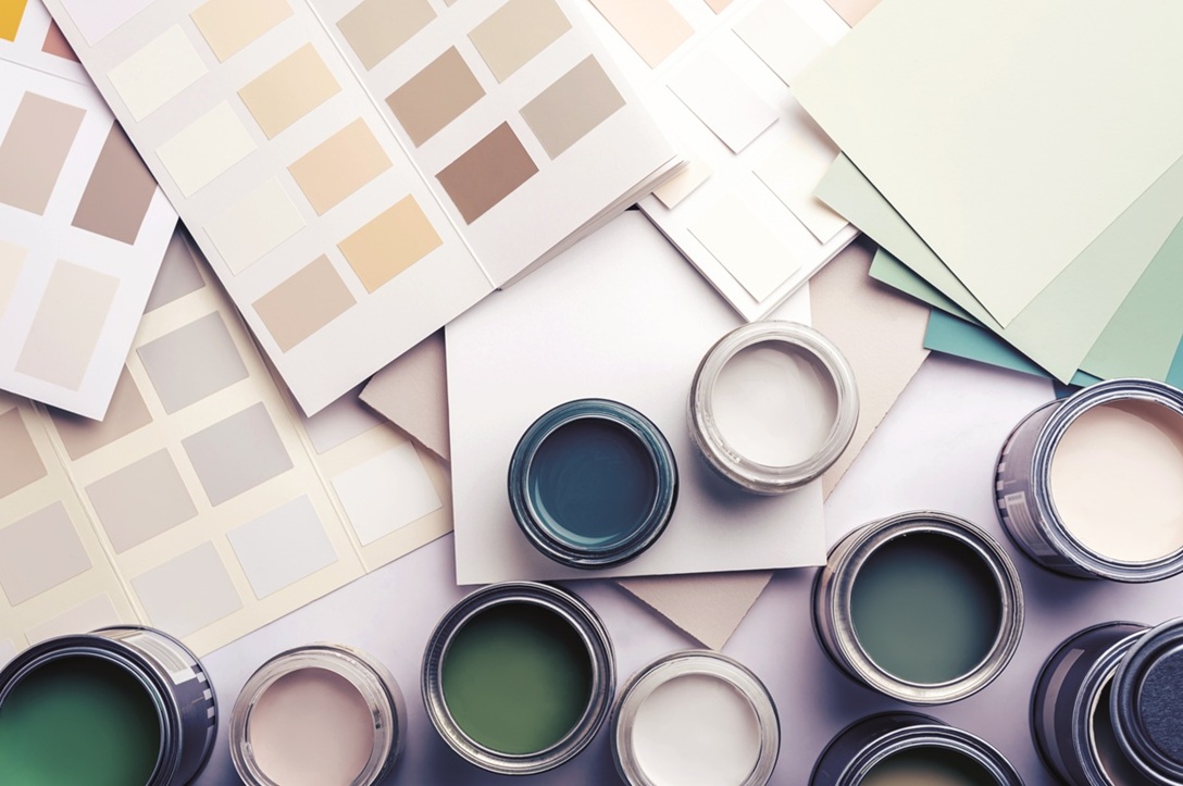
Maybe it's like Bauhaus back in the day: modern and clear shapes without any frills and then white on the outside? White is basically the theme of a person who wants to emphasize the shadow effect of the architecture or who doesn't want to see anything inside or doesn't want to decide. Light, shadow, effect: how does color influence the perception of space? Color is not just a question of taste, but also of spatial impact. How do light, wall color and paint colors interact? Which colors make an interior appear more elegant, warmer or more luxurious?
White can be neutral, but on Mallorca, where the sun shines 300 days a year, a pure white interior can be unpleasantly dazzling. As a general rule, a darker upholstery tone in the room provides structure and support. Powdered colors – i.e. colors with reduced luminosity – create a pleasant atmosphere. In combination with noble materials such as metal, stone or wood, a luxurious and harmonious ambience is created. From bedroom to kitchen: Which color suits which room? Every person has an individual color preference. But which colors are particularly suitable for certain rooms? Which colors should be avoided? This depends on a personal anamnesis. The color of a room influences our well-being - even in the dark, as our skin absorbs color vibrations. In addition to the psychological effect, material properties also play a role: colors with special coatings can help against electrosmog, mold or pollutants. These factors should be taken into account in modern interior design. Painting on Mallorca – an extensive topic: paint against sun, salt and moisture. The Mediterranean climate places high demands on exterior facades. Which paints and coating systems are ideal on Mallorca to withstand the intense sun rays and salty air?
The choice of the right paint system depends heavily on the individual circumstances of the property. Factors such as the location of the house, the orientation to the sun, the building fabric and existing coatings play a decisive role. While some paints are particularly resistant to UV radiation, others offer better protection against moisture or salt deposits. Every person has an individual perception of color. Some feel comfortable in warm earth tones, others love cool blues or greens. Is there a method for finding out which colors best suit a person and their style of living?
As a color psychologist, I developed a short color test during my studies, which I have refined over the years. With this test, I can quickly determine which color type someone is, which color palette the person needs - regardless of trends - which shapes they prefer, which light is ideal and which materials harmonize. Favorite and disliked colors are also recorded, as they provide important clues about the personality.
Courage to color: Why are we often too cautious? When it comes to wall colors, many people reflexively reach for white or beige for fear that bold colors Not every type of person likes bold colors. However, almost everyone feels comfortable in slightly powdered, harmonious colors, as they create a pleasant atmosphere. Every shade - be it green, yellow, blue or red - can be reduced in its luminosity, making it appear more subtle and stylish. This creates fine, nuanced shades of gray or warm pastels that can be perfectly integrated into a harmonious living concept.
White, on the other hand, is often an expression of indecisiveness or the fear of trying out color. Yet almost everyone wears colorful clothing - why should it be any different in your own home? With the right advice, colors can be used in a targeted way to create individual and stylish rooms. Our job as experts is to work with customers to develop a color scheme that reflects their personal style and at the same time creates a pleasant feeling of well-being. This is where it gets interesting, because I live with my wife and we are different types of people. So we had to find common ground. In the past, that was an even bigger challenge with our children - even though the parents are genetically the basis of the children, who often have similar color preferences.
My wife is more down to earth, rooted in tradition, with dimmed lighting and a desire for a steamed room. She prefers natural tones. I, on the other hand, am the restless one, always focused on the future, but still with a down-to-earth aspect in the background. I can be very colorful, but we have found common intersections that we have implemented in our living room in terms of color. As I am less at home, we agreed on earthy colors - but with nuances that also reflect my colors, but without too much chroma.
We actually find ourselves in the Mallorcan style: greige, taupe with accents in lagun green-blue, yellow-orange… Uwe Walter, www.uwe-walter-gruppe.de
Do you still remember? The color of the year 2024 was a soft pink. Initially, this caused surprise, but after the challenging years of the pandemic, many people longed for a soft, harmonious environment. Pink and its complementary color palettes created spaces that made people feel comfortable and at ease.
But 2025 is all about new beginnings! Instead of staying on the sidelines, we are focusing on optimism, joie de vivre and dynamism. Many experts have agreed on an invigorating yellow as the color of the year. This color symbolizes creativity, energy and cheerfulness. Yellow radiates warmth, lends liveliness to rooms and is even said to promote concentration.
Yellow stands for a sharp mind and intellect. Therefore, other meanings of yellow are absolute truth, rationality and wisdom. In contrast to red, which has a physically stimulating effect, yellow stimulates the mind.
In addition, 2025 colors such as white, gold and silver stand for stability and support. Opal violet, a metallic shade of blue with a reddish undertone, conveys a mixture of calm and energy.
The preservative in a certain fear: olive green continues its triumphal march in 2025. The color gives us the feeling of balance, calm, serenity, harmony and elegance. It combines wonderfully with earth tones.
Caution: Psychologically, a rejection of olive green stands for the unconscious perception that something has not yet been put in order.
If you associate yellow with sunlight and energy, then a warm yellow – yes, cognac – in combination with olive has something of security and a return to one's own strengths and solid values. And that is precisely the other reaction: the passive side. Wait and see what comes, but in strength!
White in the interior was not really conceivable at the Bauhaus back then either.
We are on Mallorca, in a good mood! Why is that? The blue sky in its various shades – The golden sunlight that creates ever new shades throughout the day – The lush green of the Mediterranean landscape... Do you notice anything? The 2025 trend is active, less passive.
A professional specialist should carefully examine the existing building fabric in order to find the best solution for the long-term durability of the façade. Without a sound analysis, even the highest quality paint can quickly lose its effect or even lead to damage. Commonly used all-round materials only offer limited protection and are not always the best choice for Mallorca's specific climatic challenges.
It is therefore advisable to create an individual concept before painting, which is precisely tailored to the structural conditions and needs of the homeowner. This ensures that the exterior coating is not only visually appealing, but also resistant to sun, salt and moisture in the long term. There are few colors that are ideal, as it also depends on the building fabric. If the damage to a building is not sustainably repaired, a coat of paint alone will not help in the long term.
The composition of a paint material should be matched to the substrate, which is often underestimated. In Mallorca, all-round materials are often used, but they only work to a limited extent in the long term.
might be too much“. What tips do you have for using color in a targeted way without it looking overloaded?
As I miss the blue sky in Germany, I am naturally more drawn to Mallorca.
Personally, I need the fresh May green for my development, but also the structured ultramarine in its purest form to feel good. My wife needs these colors in a toned-down form and prefers the earthy natural tones.
Only when it comes to light are we not energetically compatible: while my wife prefers dimmed, cozy light in the evening, I need more brightness - otherwise I fall straight into sleep mode.


